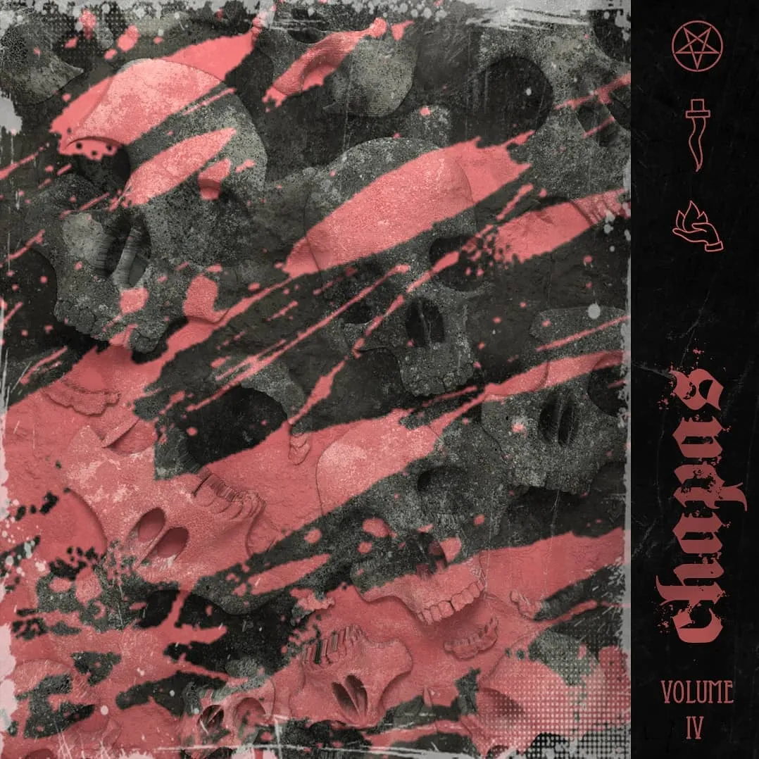
A field of skulls, packed shoulder to shoulder until they stop reading as individual objects and start reading as terrain. Jaws, cheekbones, and eye sockets tile edge to edge — no horizon, no hero skull. Over the top, diagonal slashes of a dusty salmon red rake across the frame from lower-left to upper-right, splattering into dots and flecks where they break. Everything else is desaturated: cool grey bone, near-black shadow, a concrete-like grain sitting over the whole surface.
The right edge breaks into a black vertical band carrying the mix’s marks — an inverted pentagram, a dagger, a small flame — stacked above blackletter type set sideways, with the volume number beneath it. That band does the compositional work: it gives the chaos a hard stop and gives the eye somewhere to land.
The mix series is where the crew’s identity got its furniture: a pentagram, a dagger, a small flame, blackletter type, all stacked into a band on the right edge where every volume can carry the same marks in the same place. Skulls turn up again, flattened into terrain instead of given a face. The volume number is the giveaway that this was identity work rather than a one-off cover, because a layout meant to be reused has to survive being reused.
How the pipeline gets there
Cinema4D is the modelling and layout half. A dense field like this gets built once and then repeated across the frame, so the arrangement stays controllable instead of hand-placed.
The Octane render is where the light lives. The shadows down between the skulls are soft and occluded rather than stamped on, and the bone reads as a rough dielectric with real falloff across each curved surface. That contact shadowing is what makes a monochrome pile of near-identical objects legible at all — without occlusion doing the separating, a field like this collapses into noise.
Photoshop is where the render becomes cover art. The red sits on top of the image rather than inside the scene: the slashes ignore the geometry underneath them, which is exactly why they read as marks on a surface rather than paint on skulls. The grain, the halftone patches, the edge scuffing, and the typography all live at that stage too.
Why it works at thumbnail size
Cover art has to survive being displayed tiny — a fingernail-sized square in a scrolling list. Shrink this one down and what’s left is two things: one saturated colour against grey, and one hard vertical division. Neither depends on detail. The skulls dissolve into texture at that size, but the red diagonals and the black band still hit, and the type on the band stays a recognisable shape even when it stops being readable. That’s the test a cover has to pass before anything else about it matters.